
A SHINY NEW BRAND LOGO (FUN FOR SOME!)
Hello world!
Welcome to my shiny new blog … and brand. A few months ago, Ammit Creative was just an idea in my head. And now here it is, bright and colorful and fully realized.
A lot of work goes into launching a small business. I’ll be honest—figuring out accounting and vendor relationships and paperwork isn’t a lot of fun for me. But the branding stuff is in my wheelhouse and it’s rare to have the chance to run amok and just do me.
From the name to the palette to the word choices and voice, I wanted the brand to represent me and my promise to clients—to put my very best into any project they toss my way. The external branding is designed to communicate an internal promise. And no single asset is more essential for representing the brand identity than a logo. I’ve worked on a fair number of logos over the years, but this is only the second time I’ve done one for myself, and I’m exactly nerdy enough to count it as a good time.
Here’s the thing about a new brand logo—the options can feel endless. Even when you narrow down to font and palette and tagline, there are many ways to put a logo together. Do you want tall and stacked or long and narrow? Do you want a logo that works on white or on any color? Do you want a color that triggers a specific emotion? For the Ammit Creative logo, I wanted something bold and colorful and, well, me.
Here’s a peek at how the early stage looked for Ammit Creative . . .
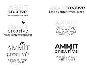
In the end, the choice made itself. Only one option embedded a story, as so many great logos do. (Think: the “mom” written in Wendy’s collar or the smile from Amazon’s A to Z). Above all, the final choice had three visual clues that tell the story of Ammit and speak to organizational promises.
First, the final logo puts the heart at the very center of the logo … just like heart is at the center of our work.
And yeah, the dotted i is a little juvenile, as is the multi-colored heart. But me and the team here are all about a warm brand voice. And although we take our work very seriously, we try not to take ourselves too seriously. We’re comfy with a logo that reflects that.
And–and this is the third thing–I do like that the i is unique. Unique individuals (Is!) are valued here as well.

I think we landed on a logo that’s warm and friendly and professional, a logo with heart. I hope it sparks a little joy and helps us start our new adventure with posh, and polish, and a big dose of determination.



 To understand our name, you need to know two women: our founder … and an ancient Egyptian demon goddess.
Because yep, Ammit is an ancient demon goddess. Often called the Devourer, Ammit gobbles up the hearts of the undeserving when they die. If that sounds like a strange character to name a content marketing firm after, you should get to know our founder and leader, Malayna Evans. In addition to a passion for clients and content, Malayna is a legit expert in ancient history. So when she started the biz, a demon goddess who specializes in understanding life stories, analyzing emotional realities, and gobbling up hearts seemed like an appealing fit.
To learn more about Malayna, content marketing, and possibly an occasional dash of ancient history, check out our blog.
Leave a Reply
You must be logged in to post a comment.